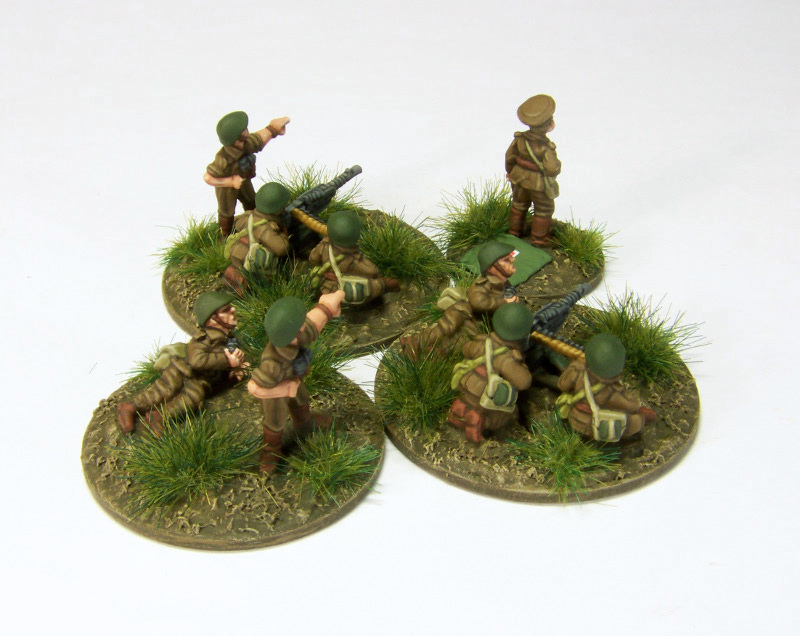
Yes, the webbing was VMC 887 Brown Violet for a shadow colour on all bags/straps. The base on the lighter bad/strap was 988 Khaki then Panzer Aces 322 US Highlight Tankcrew. The greener bag/strap was 881 Yellow Green, the highlighted by mixing some 837 Pale Sand into the Yellow Green.
Uniform was 889 US Olive Drab shadow, 826 German Camo Medium Brown, then overall highlight with a mix of 1:1 GCMed Brown and 914 Green Ochure (I mixed a bottle, this lightened the uniform and desaturates the brown), finally edge highlights on the top of folds, etc. by mixing some Pale Sand into the 1:1 Brown mix.
Leather bits 822 German Camo Black Brown, 984 Flat Brown, then 846 Mahogony for highlights.
Many thanks for this very detailed recipe! The edge highlights work a treat, though I am surprised the 1:1 ratio for pale sand did not significantly lighten the German Camo Medium Brown + Green Ochre mix. As for the greener webbing, is the base pure Yellow Green, or did you use something darker?
Greener Webbing: (1) Brown Violet, (2) Yellow Green, then (3)mix some Pale Sand into the Yellow Green to make highlights.
The Uniform is four layers total:
(1) US Olive Drab 889 (2) 826 German Camo Medium Brown (3) Highlight with custom mix/new colour (which is a mix of 1:1 GCMed Brown and Green Ochre..these are mixed together to mae a new colour, not used separately). (4) Add Pale Sand to the third colour for edge highlights.
Adding Pale Sand to (3) will definitely lighten it, I'm not sure why you think it would not?
You misunderstood me; I meant that I thought the mix would result in a more glaring contrast, which would have detracted substantially. In other words, I was expecting a smaller proportion of the pale sand.
FWIW the final edge highlight (the mix with the brown highlight colour and Pale Sand) was probably about 3:1 or maybe 2:1 Brown:Pale Sand, I don't quite recall. I use a wet pallet, make a mix and try a few highlights and lighten or darken from there based on the look: the ratio is a guide, you may need to modify it based on what you're seeing in person.
Another concern was not to go too bright, since I wanted the uniform to be brown, not over-highlighted to the point where it would look more like khaki or similar. These are older paint jobs though; ideally the contrast could have been increased on many figures but I preferred to just get them based and done.


Lovely!
ReplyDeleteBeautiful painting. Any chance you could share the paints you used on them? I assume that you used two different colours for the webbing?
ReplyDeleteYes, the webbing was VMC 887 Brown Violet for a shadow colour on all bags/straps. The base on the lighter bad/strap was 988 Khaki then Panzer Aces 322 US Highlight Tankcrew. The greener bag/strap was 881 Yellow Green, the highlighted by mixing some 837 Pale Sand into the Yellow Green.
DeleteUniform was 889 US Olive Drab shadow, 826 German Camo Medium Brown, then overall highlight with a mix of 1:1 GCMed Brown and 914 Green Ochure (I mixed a bottle, this lightened the uniform and desaturates the brown), finally edge highlights on the top of folds, etc. by mixing some Pale Sand into the 1:1 Brown mix.
Leather bits 822 German Camo Black Brown, 984 Flat Brown, then 846 Mahogony for highlights.
CdlT
Many thanks for this very detailed recipe! The edge highlights work a treat, though I am surprised the 1:1 ratio for pale sand did not significantly lighten the German Camo Medium Brown + Green Ochre mix. As for the greener webbing, is the base pure Yellow Green, or did you use something darker?
DeleteGreener Webbing: (1) Brown Violet, (2) Yellow Green, then (3)mix some Pale Sand into the Yellow Green to make highlights.
DeleteThe Uniform is four layers total:
(1) US Olive Drab 889
(2) 826 German Camo Medium Brown
(3) Highlight with custom mix/new colour (which is a mix of 1:1 GCMed Brown and Green Ochre..these are mixed together to mae a new colour, not used separately).
(4) Add Pale Sand to the third colour for edge highlights.
Adding Pale Sand to (3) will definitely lighten it, I'm not sure why you think it would not?
CdlT
You misunderstood me; I meant that I thought the mix would result in a more glaring contrast, which would have detracted substantially. In other words, I was expecting a smaller proportion of the pale sand.
DeleteAnd in case this needs to be spelt out even further: the original comment was supposed to convey my sense of pleasant surprise, not scepticism.
DeleteSure, just making sure I'm being clear.
DeleteFWIW the final edge highlight (the mix with the brown highlight colour and Pale Sand) was probably about 3:1 or maybe 2:1 Brown:Pale Sand, I don't quite recall. I use a wet pallet, make a mix and try a few highlights and lighten or darken from there based on the look: the ratio is a guide, you may need to modify it based on what you're seeing in person.
Another concern was not to go too bright, since I wanted the uniform to be brown, not over-highlighted to the point where it would look more like khaki or similar. These are older paint jobs though; ideally the contrast could have been increased on many figures but I preferred to just get them based and done.
CdlT